iOS 6 and the End of Skeuomorphism
The Skeuomorphic Icons of iOS 6
It was June 2012 when Apple unveiled the next major update to iOS, the iOS 6. This was the last version to feature Apple’s Skeuomorphic design language before iOS 7 arrived and changed everything.
Skeuomorphism focused on making digital elements look like real-world objects, so everything felt familiar without needing to learn how it worked. The shadows, 3D effects, textures, brightness, and details were all designed to mimic real objects, creating a more realistic and tactile experience at the time.
iOS 6 was first released alongside the iPhone 5 in 2012, but older models like the iPhone 4 and 4S were also able to update to it. Today, of course, iOS 6 is obsolete and no longer supported. However, some devices that originally supported it can still be downgraded back to that version.
I’ve personally always liked the way iOS 6 looked, and honestly, I miss that era. When I think of iOS, the first design that comes to mind is iOS 6. I’m not sure why, but the depth in the icons and that layered look always gave me a sense of the original, classic iPhone experience.
In many ways, iOS 6 helped shape what iOS is today. Even though Apple moved away from skeuomorphism, that focus on clarity, usability, and intuitive design never disappeared. The foundation built during those early versions made it easier for Apple to evolve the interface into something more modern without losing the simplicity that made the iPhone so accessible in the first place.
Today, iOS looks very different — more glassy, more minimal, more modern. That classic feel now lives mostly on collector devices. Time really does fly.
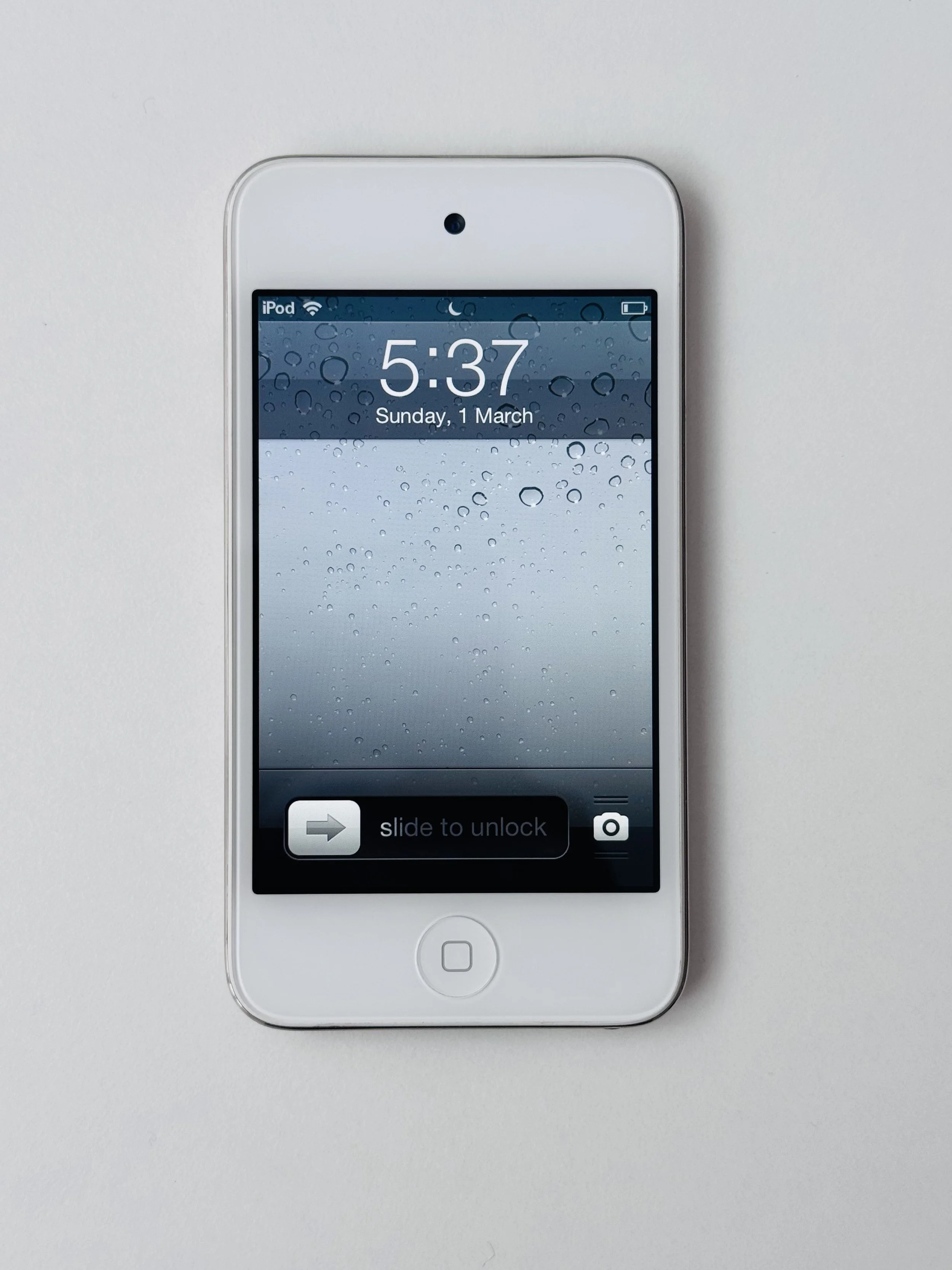
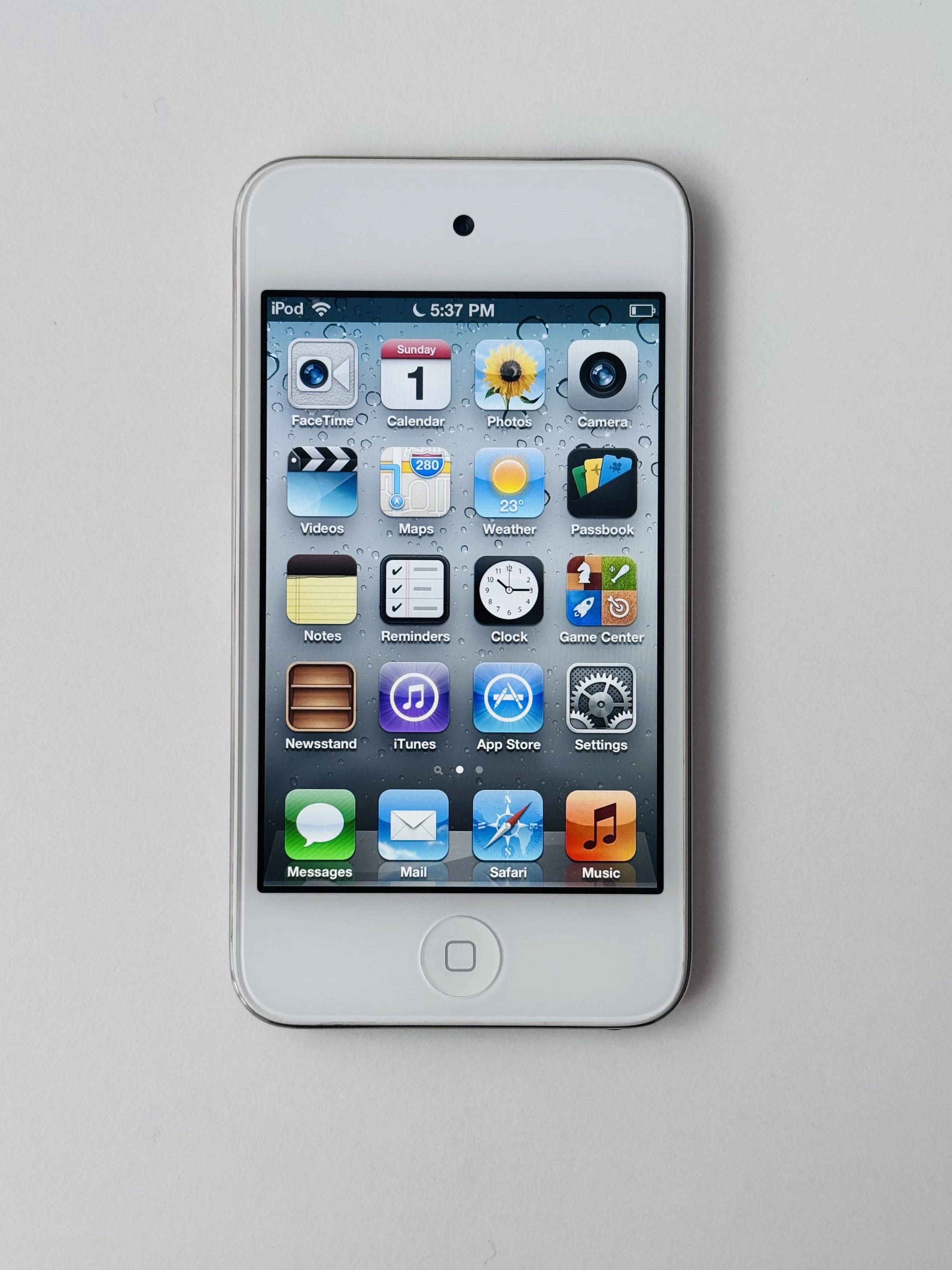
My iPod Touch 4th Generation running iOS 6.
If you also enjoy the skeuomorphic icons from iOS 6 and would like to customise your phone with them, you can download them using the link below.